You don't just see great brands, you feel them!
I've designed logos for brands in the sports, health and fitness, government, charitable, logistics and financial sectors. It's a humbling experience to see a logo that started off as a sketch on a post-it note end up on front page of a publication.


It all started with an idea and a sketch!
I have worked with the London Borough of Harrow to rebrand their logo. In creating a new logo I also designed the street signs incorporating the new crest on the street plates around the borough.
Along with the street signs I also designed branded uniform, wayfinder signs, flags, road borough entry signs and office stationary. The new logo intended to incorporate tradition with modernism.
New branding for a team and an organisation just bursting with pride!
When I was emailed late one night with a new logo request for an ice hockey team of course I jumped out of bed and grabbed my sketchbook. I love creating and being somewhat of a night owl, most of my better ideas come when admittedly I should be sleeping!
The logo request came from the Coachella Valley Pride Hockey organisation based in Palm Springs, CA. Their mission is “to introduce hockey to the LGBTQ+ community and enjoy the great game of hockey in a safe and inclusive space.” This mission needed to be echoed in their new logo.
The Eagle (Strength)
The geometric eagle represented a few things. An eagle spreading its wings can be a display of strength and dominance. The design of the wings symbolises the mountain peaks you see across every horizon around the Valley.
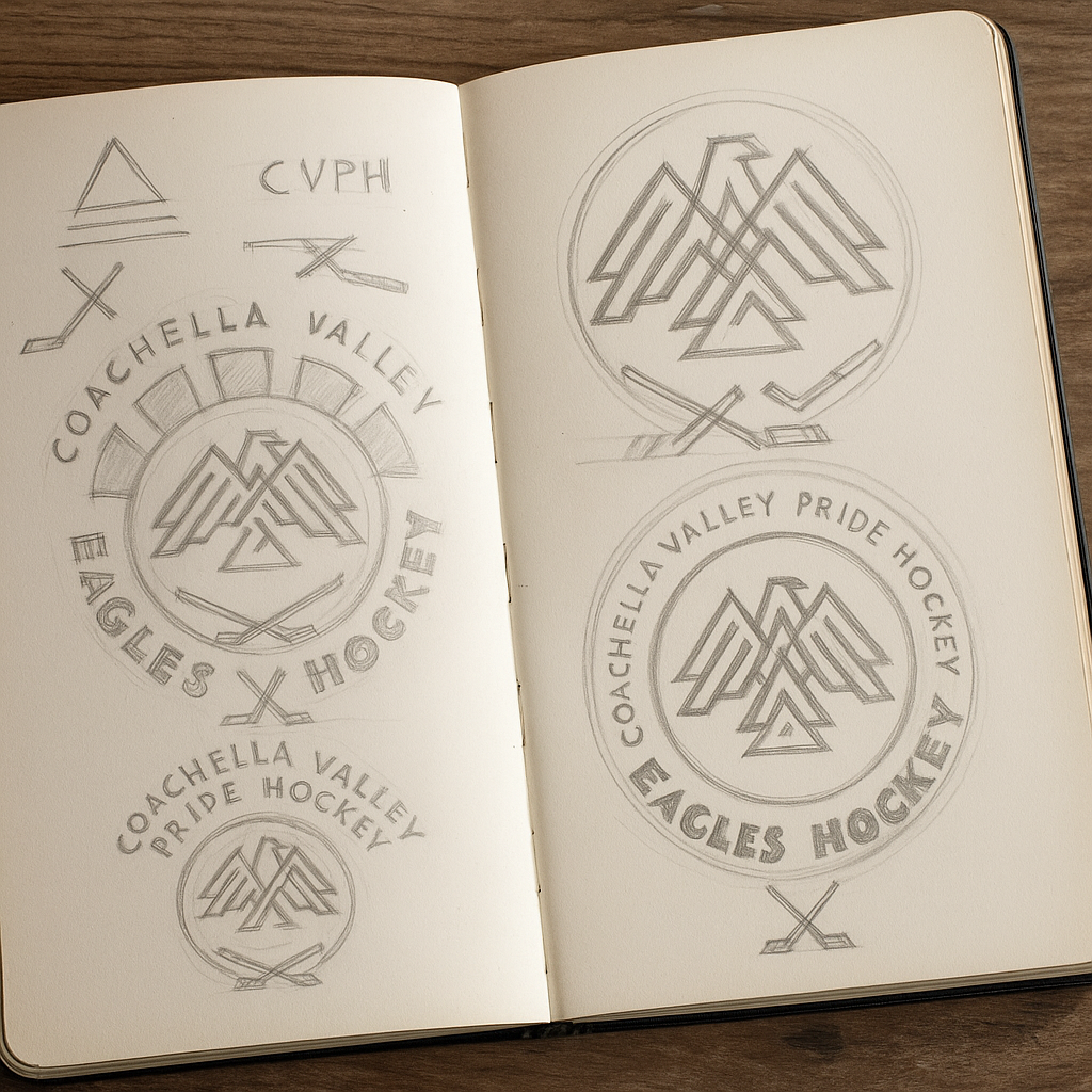

Art Deco (Pride)
I incorporated six bold shapes across the top of the circle each with its own colour. These shapes were colourised with the pride colours and represented abstract rays of sunlight creeping over the horizon behind the eagle.

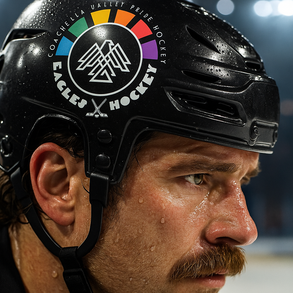
Typography (Context)
Your eye is drawn to the break in the circle which adds context, a pair of hockey sticks and a single puck. The cross over hockey sticks were designed to create a symmetry with the triangular shapes of the eagle’s wings above.

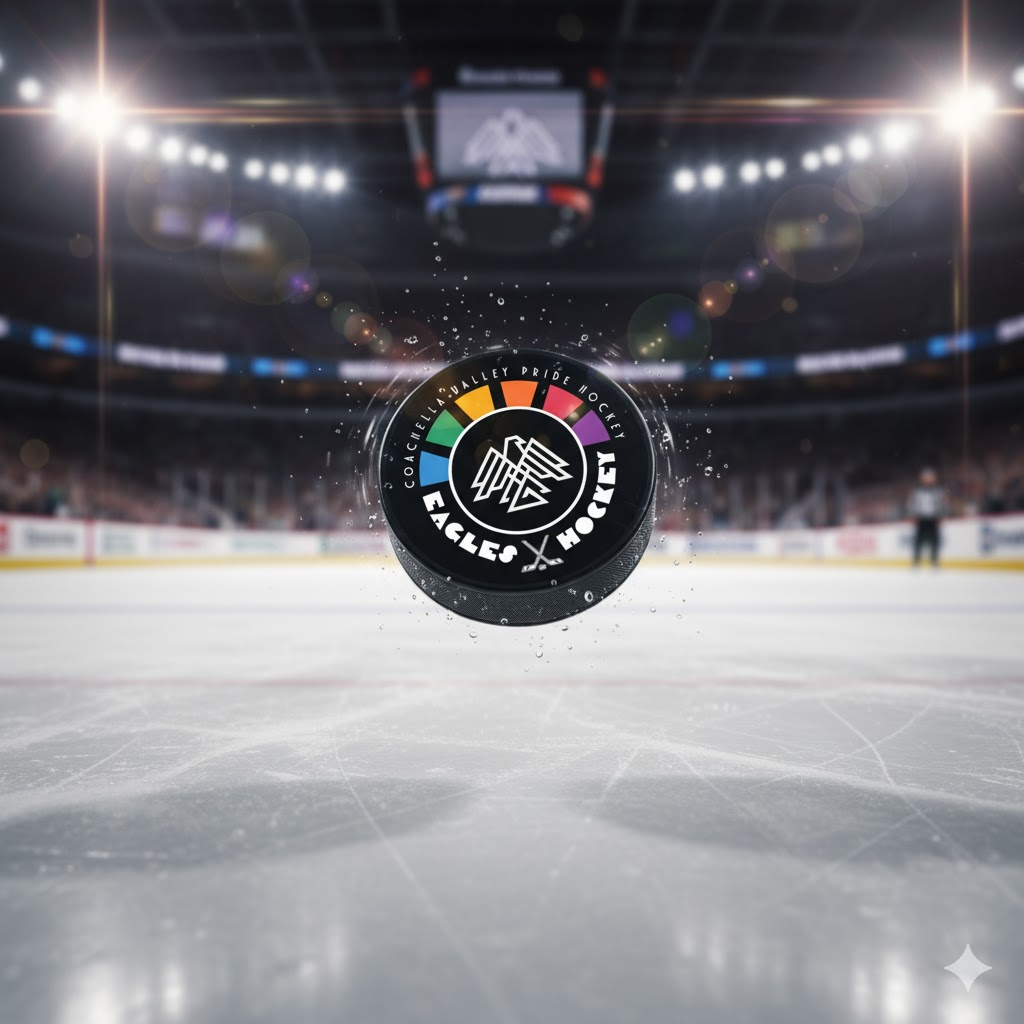
Flexibility (Robustness)
I knew that the Eagles primarily needed a logo that was easy to be embroidered on their team gear so that’s why I opted for bold, larger shaped elements that weren’t too intricate to replicate.


A new logo for Hertfordshire based heating experts: Happy Heat
Happy Heat had a quirky and fun logo, a smiling flame between the words ‘Happy’ and ‘Heat’. To soften the logo and the feel of the brand I rounded the edges of the text and flame. I also toned down the red colour to make it less harsh on the eye. I added a subtle gradient and removed the small detail to the left of the flame to simplify the character and make it easier to replicate on other mediums such as embroidered clothing. The name was trademarked and the logo was fully re-vectorised.
I'm the guy behind the logo for Harrow!
In 2022 the London Borough of Harrow set out to rebrand themselves for the first time in three decades. I took the reigns and brought my vision to life. I wanted to merge tradition and values with modernism.

Helping brands make a lasting impression
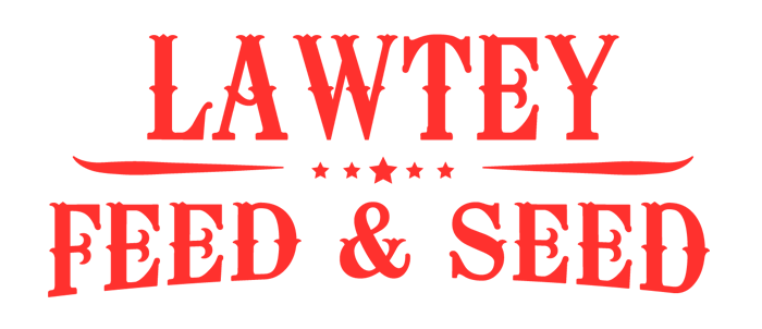
I've worked with some great brands at the very start of their journies. I created a logo for a start-up in rural northern Florida selling and dispatching feed for livestock. As well as creating their logo and e-commerce website, I created brand guideline documents to ensure their presence remain professional and focused.
"His guidance throughout the process was genuinely valuable."
Martin @ Happy Heat, UK 
"Ty absolutely crushed it."
Brian, California, USA 

"You truly understood the brief from the outset."
Jenny, Hertfordshire, UK
"Exceptional Website Transformation by Ty - A Remarkable Experience!"
"I had the privilege of working with Ty on a website and branding redesign project, and I am absolutely thrilled with the results! Ty's expertise and dedication to enhancing my website, moving it from a dated legacy location to a modern, captivating platform, truly exceeded my expectations. From the moment I engaged with Ty, I knew I was in capable hands!"
Brian, California, USA

"A huge Shout-Out to Tyinthewood for Our Amazing New Website!"
Rana + Darren, Yorkshire, UK
"Ty 'got it' right from the start - he knew exactly what we were looking for!"
Stephen, Massachussetts, USA
"The website is exactly how I imagined it to be. I highly recommend Ty!"
Menik, London, UK
"I recommend Ty for all your design work!"
Roshan, London, UK
"Choosing to work with Ty most definitely added value to our product."
Matt, London, UK

Want to grab a coffee and talk about your project?
If you would like to share an idea or work together on a project, drop me a message. Even better, if you are local, let's grab a coffee, donut or pastry and discuss your idea!
How I can help you:

Registering your unique domain name
Setting up your new hosting
Partial or full copywriting
Setting up a business email account
Graphic design and print marketing materials
Social media set up and integration
WhatsApp me!
If you're on your phone you can tap the button in the bottom right of your screen to WhatsApp me directly!
By contacting me online you are agreeing to being contacted by me and only me. I will not share your personal details with any other third party. (That is a pinky promise!)